
Portfolio
Explore my recent works
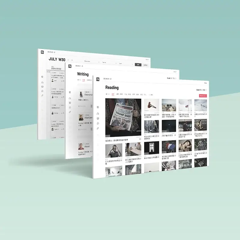
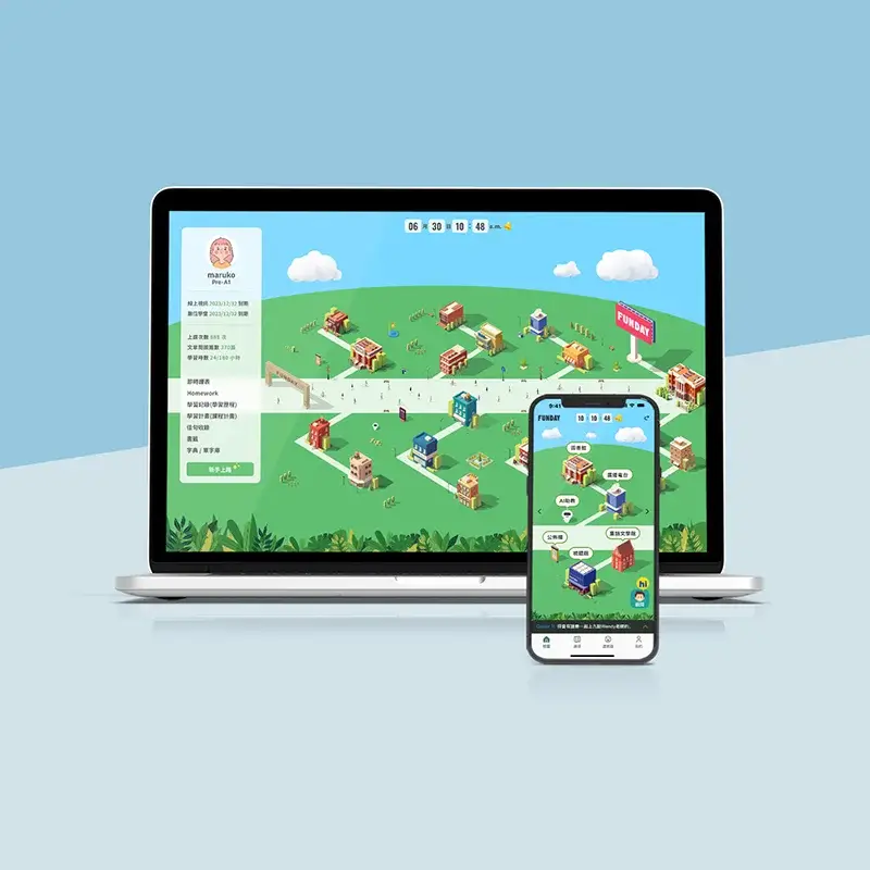
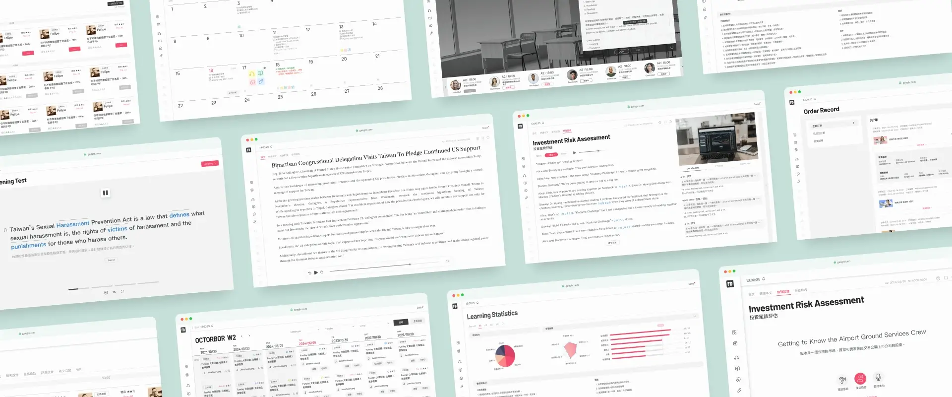
Learning Platform Redesign
DURATION
2023/10 - 2024/06
My Role
UI/UX designer & PM
This is a redesign project for a 20-year-old online learning platform. The founder aims to move away from the outdated traditional embossed design style and create a minimalist learning platform. The new design focuses on the learners, emphasizing content and the learning experience without distractions from the interface. Clear and intuitive navigation ensures learners can quickly find the resources they need, fostering a more immersive learning environment.
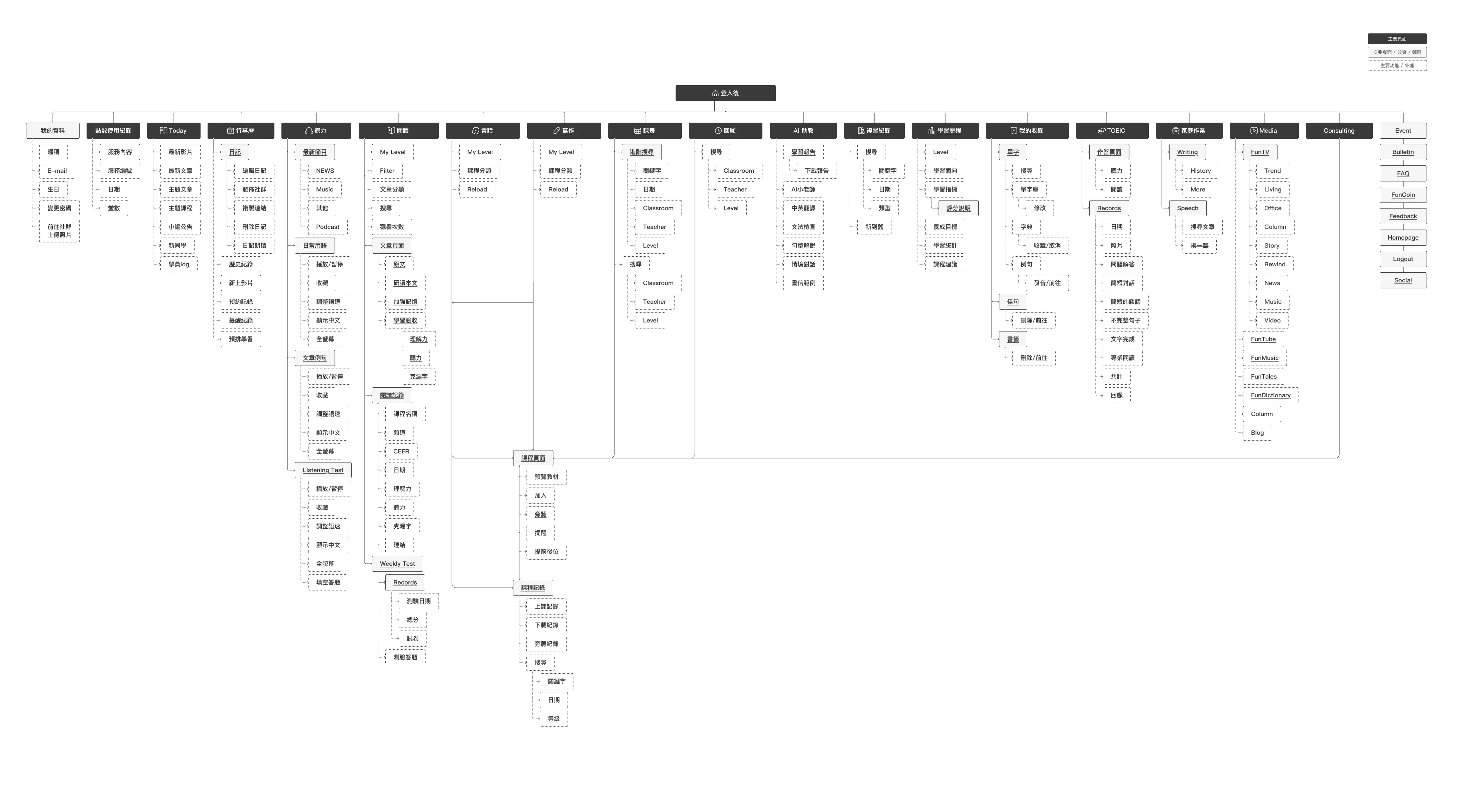
After reviewing the features of the old site, I clarified the requirements and mapped out the functionality for the new version.
The challenge 1
This platform, which has not been updated for over a decade, has undergone a significant redesign. All existing features must be retained and reorganized, adhering to minimalist design principles, allowing new members to quickly get started without requiring personal guidance. At the same time, it must meet the needs of long-time members accustomed to the previous website's operational logic. Such a major overhaul will inevitably involve an adaptation period, potentially requiring users to invest additional effort in learning the new interface.
My solution
Due to the limitations of our engineering capabilities, we were unable to conduct gray release testing. Instead, within the constraints of a limited timeline, we implemented an alternative approach: a button allowing users to revert to the old version was provided exclusively for existing members. New features were made available only on the new version, gradually encouraging existing users to transition. Simultaneously, we collected user feedback through surveys, continuously fine-tuning the new version until most users found it acceptable and adaptable, before fully phasing out the old version.
1.Option to return to the old version
2.Feedback collection via button
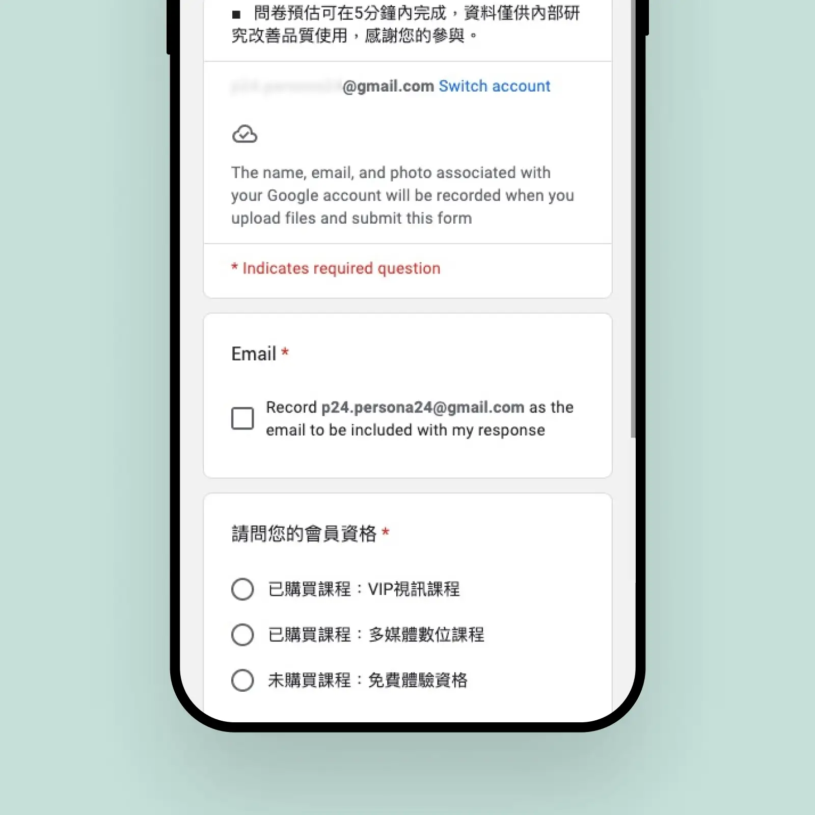
Used Google Forms to ease engineering efforts
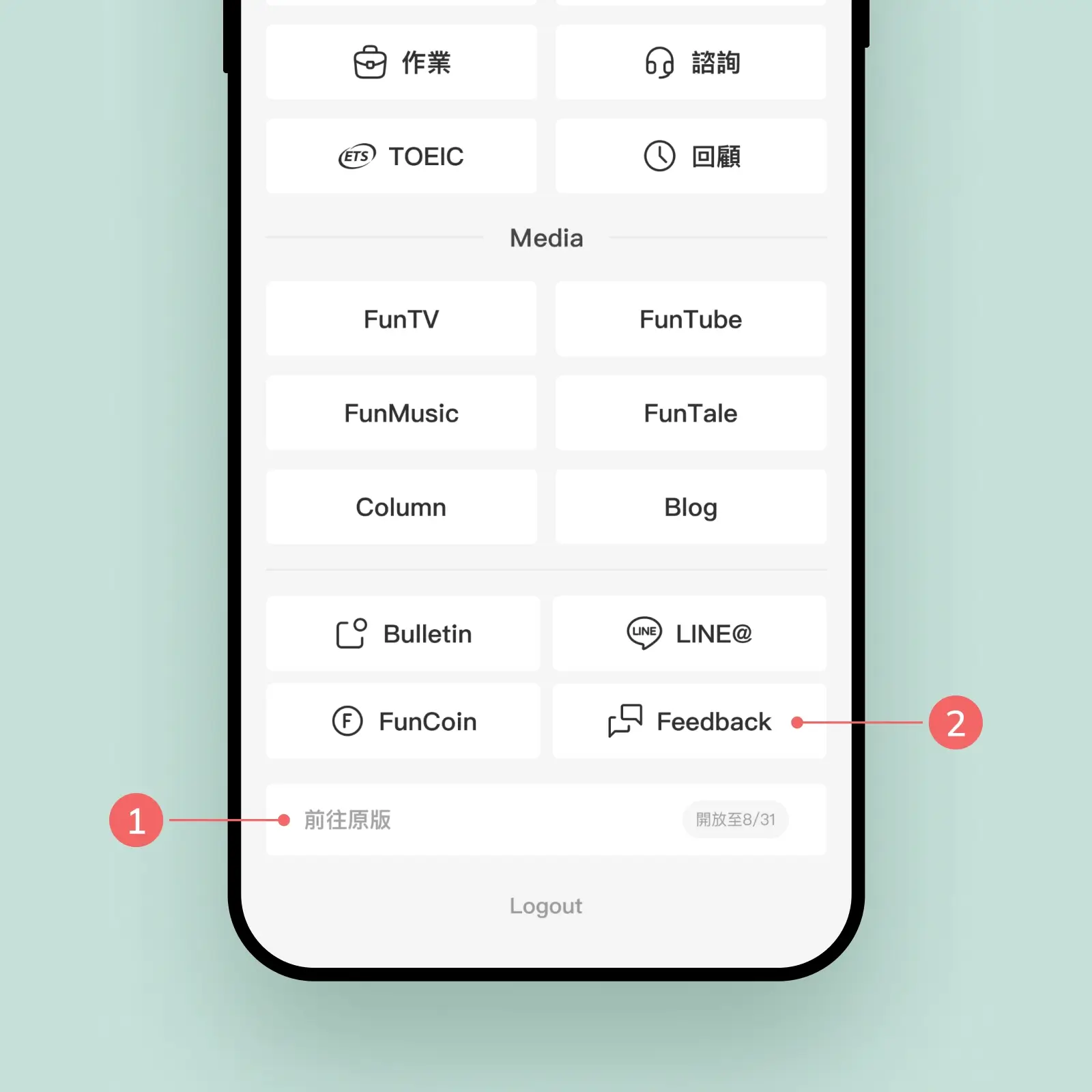
The challenge 2
Most users prefer using desktop devices for learning, so the design prioritizes the desktop platform. However, adapting features to mobile devices often proves challenging due to their complexity, making it difficult to streamline and optimize.
My solution
When designing for mobile, secondary or redundant features should be removed to focus on core content and operations. Pagination and structural adjustments can be employed to present content step by step, ensuring the mobile interface remains intuitive and clear.
The small-sized interface uses pagination and structural adjustments to progressively present content, ensuring an intuitive and clear user experience.
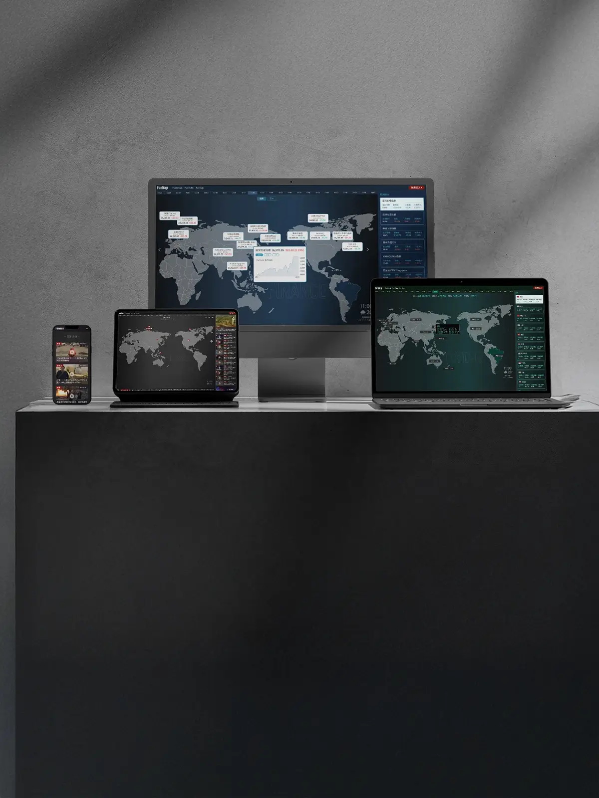
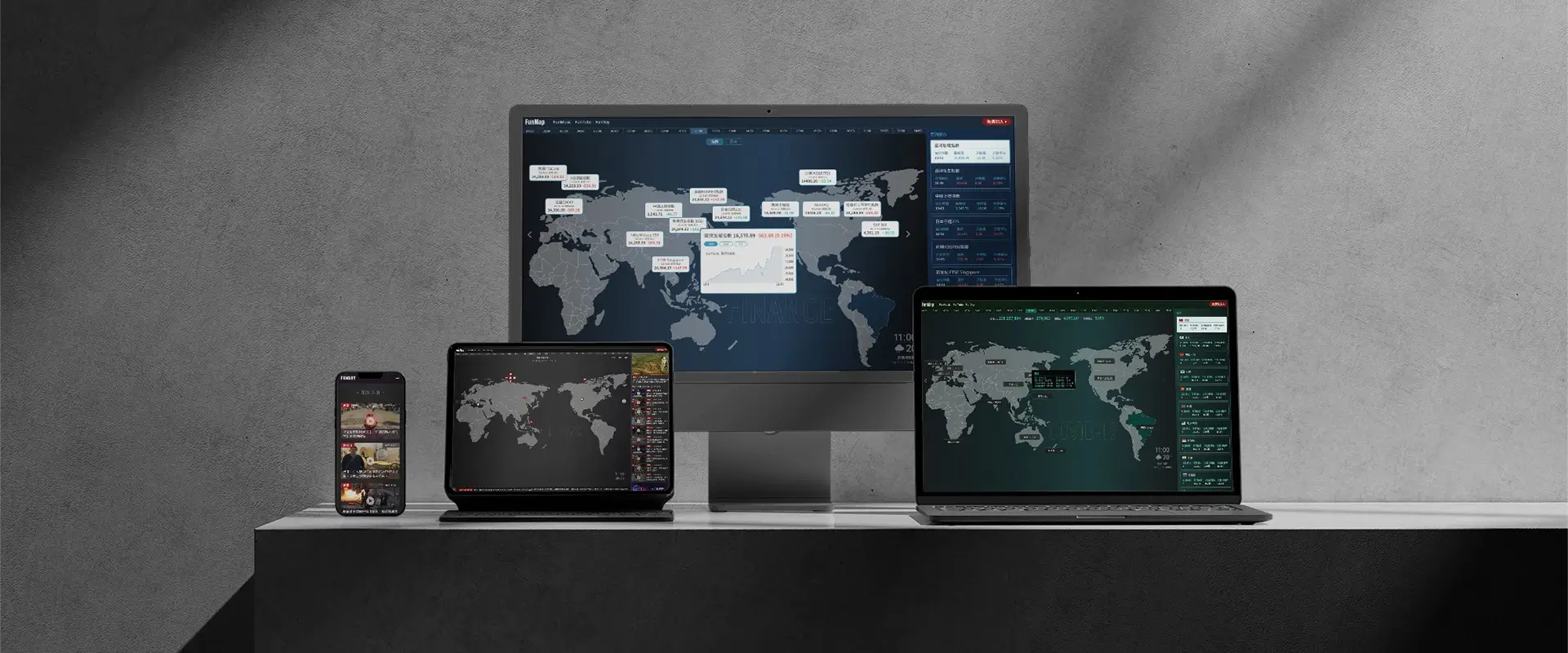
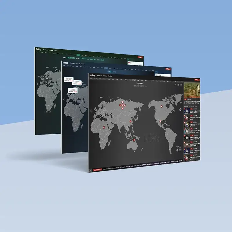
World Map | News Finance Pandemic
DURATION
2021/10 - 2021/12
My Role
UI/UX designer & Motion Designer
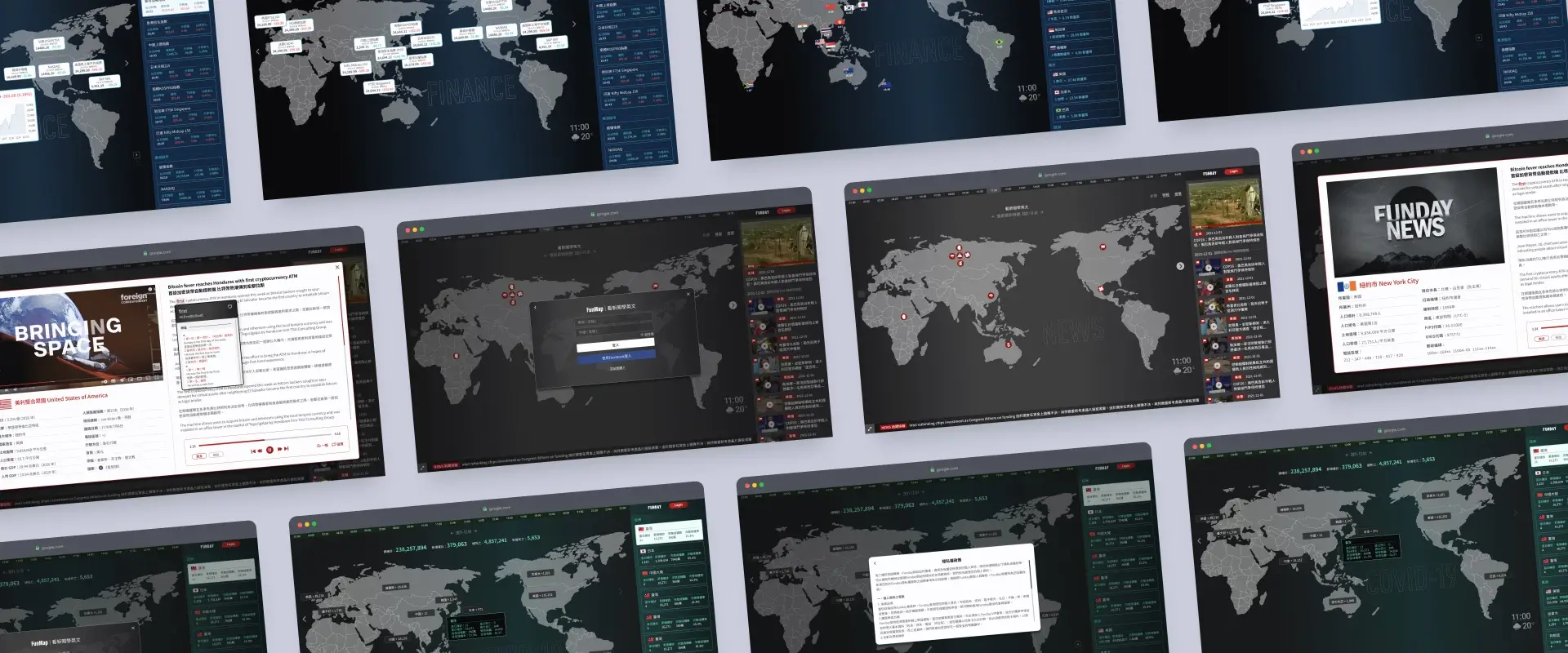
This is an interactive website that integrates global information, presenting three major themes: News, Finance, and Pandemic through visualized maps. Users can easily switch between topics to browse real-time updates on global data, such as pandemic trends, stock market dynamics, and major news events. The website offers a seamless responsive design for both desktop and mobile versions, enhanced with dynamic interactive features and precise data annotations, providing users with an optimal experience in both visuals and functionality.
The challenge 1
The high concentration of data in a few areas results in visual imbalance and clutter, making it challenging to present geographic locations accurately. Balancing information distribution and maintaining visual clarity across devices is a key design challenge.
My solution
The right-side list and map are interconnected, allowing interactive effects to sync between them when hovering over information on either side. Clicking on any item in the list or on the map will trigger a popup displaying detailed content, enhancing usability and intuitive interaction.
When icons on the map are clustered together, the right-side panel can be used to quickly link and select related news.
The challenge 2
The differences between the desktop and mobile layouts create an inconsistent user experience, particularly on mobile, where maps cannot intuitively display specific regions. This weakens the geographic relevance and clarity of the information.
My solution
The mobile version adopts an interface consistent with the right-hand section of the desktop layout to enhance the overall experience. Additionally, regions (such as continents) and national flags are used to help users quickly locate and identify the necessary information.
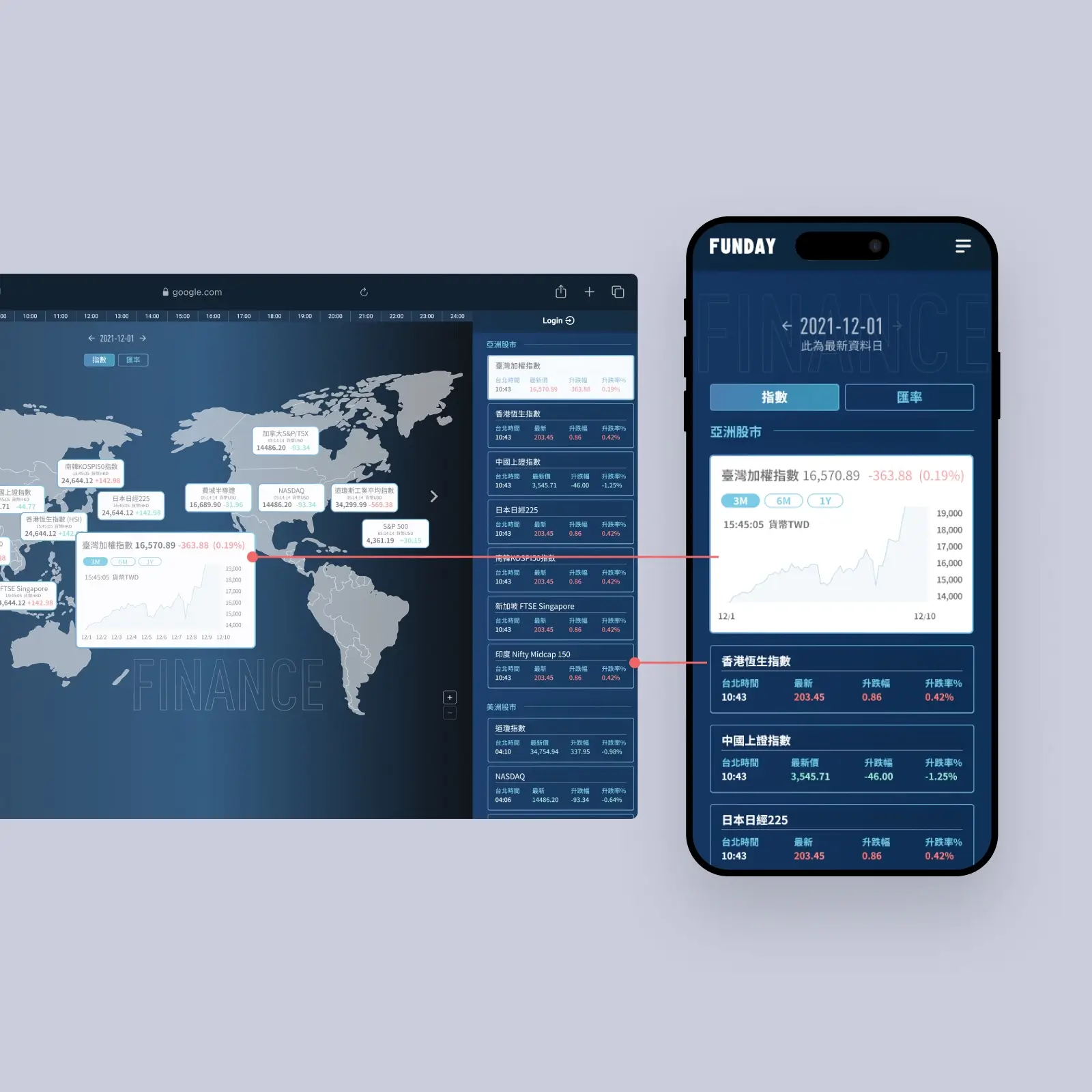
The mobile version adopts an interface consistent with the right-hand section of the desktop layout to enhance the overall experience.
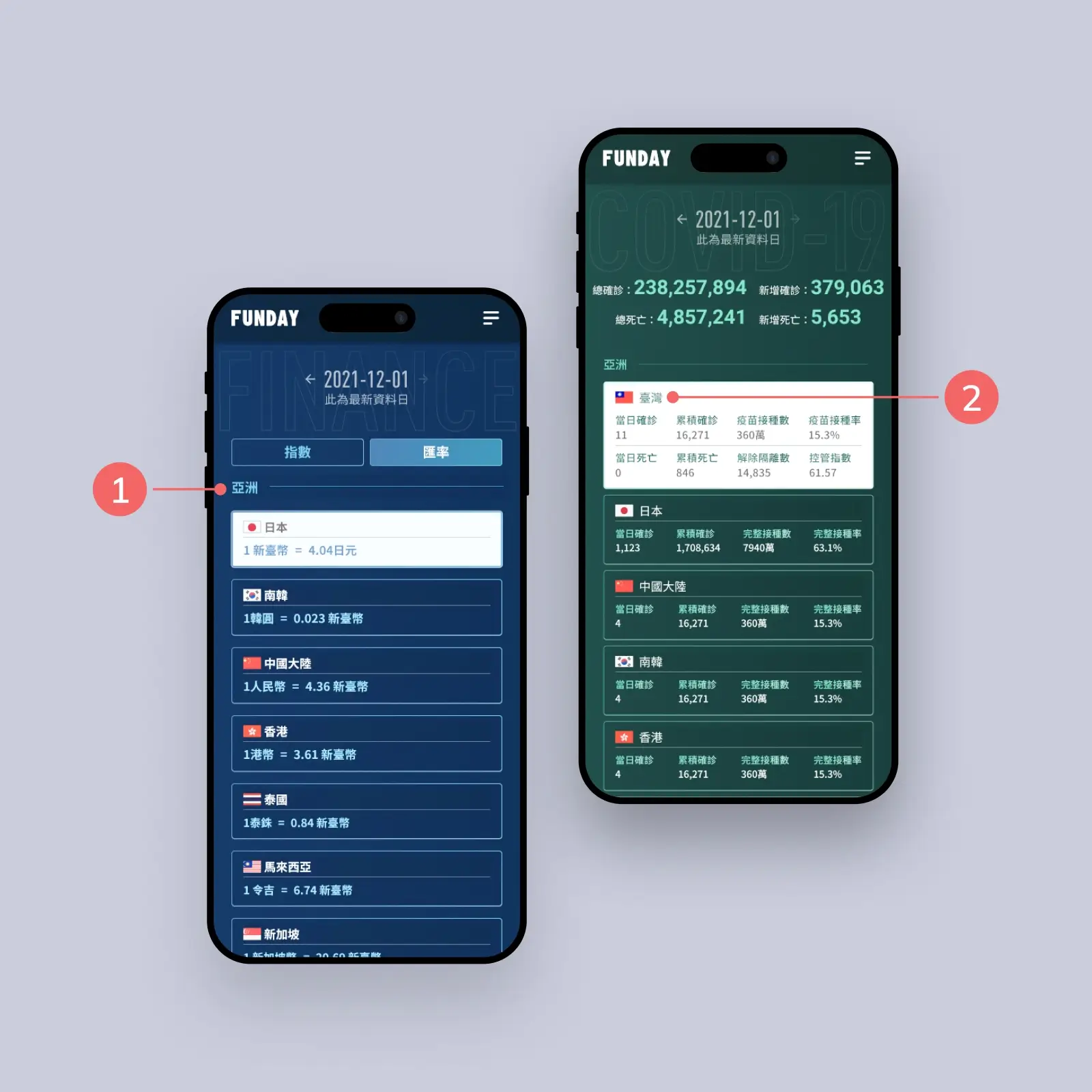
1.Group by continent to help users locate regions efficiently.
2.Add recognition with flags for quicker navigation.
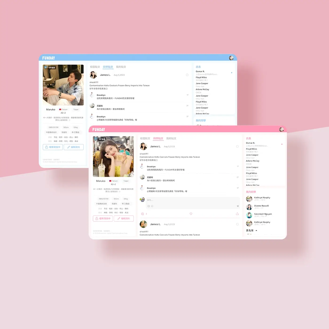
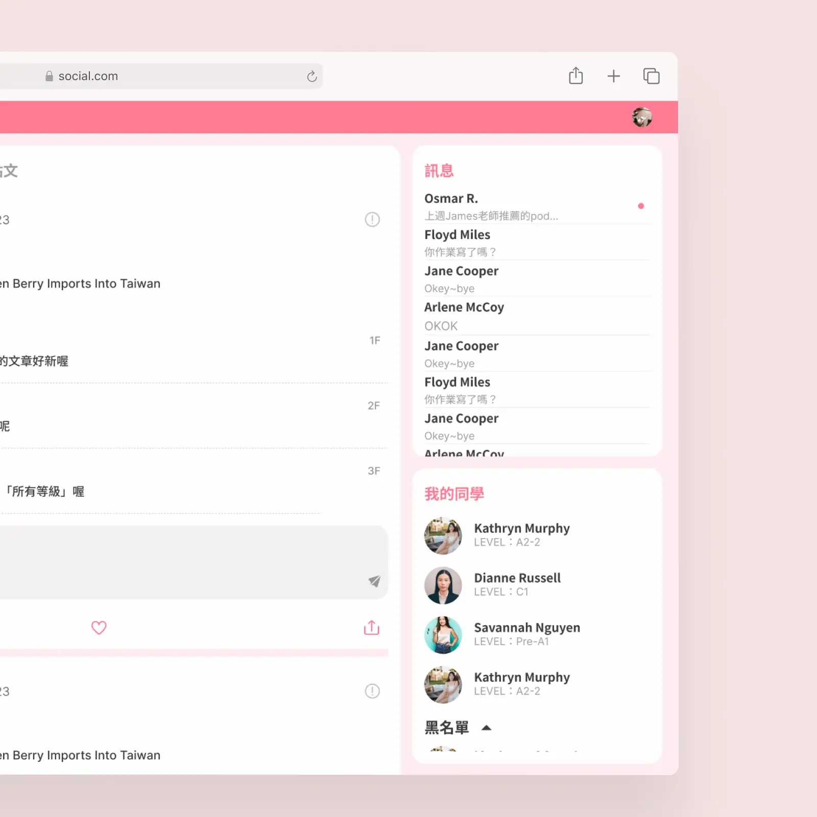
Social: Connect Learn Share
DURATION
2023/05 - 2023/08
My Role
UI/UX designer & Motion Designer
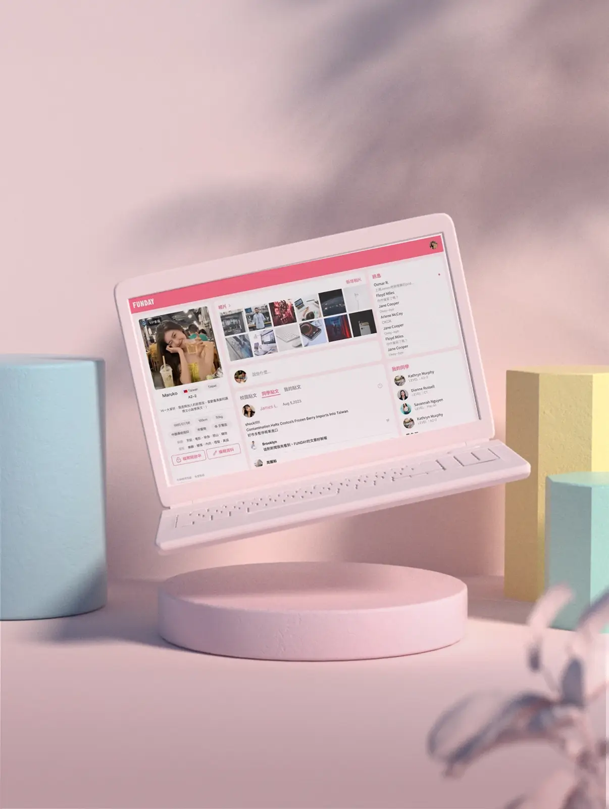
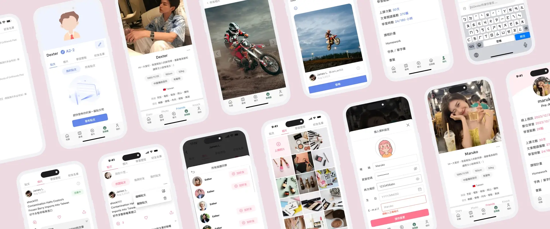
This is a social platform designed specifically for English learners, allowing users to share their learning progress and insights through posts, messages, and study updates. Whether exchanging tips with classmates or sharing moments from daily life, you can connect with like-minded individuals here, making English learning more engaging and interactive.
The challenge 1
Implementing a feature that uses different colors based on gender for the first time revealed an impact on the visual consistency of the overall interface, especially in multi-user scenarios such as comment sections or friend lists, where it created a sense of clutter.
My solution
Maintain consistent base colors for the interface and use gender-specific colors sparingly as supplementary indicators in smaller areas, such as personal profiles. In most cases, adopt shared neutral colors to enhance visual harmony while retaining a degree of personalization.
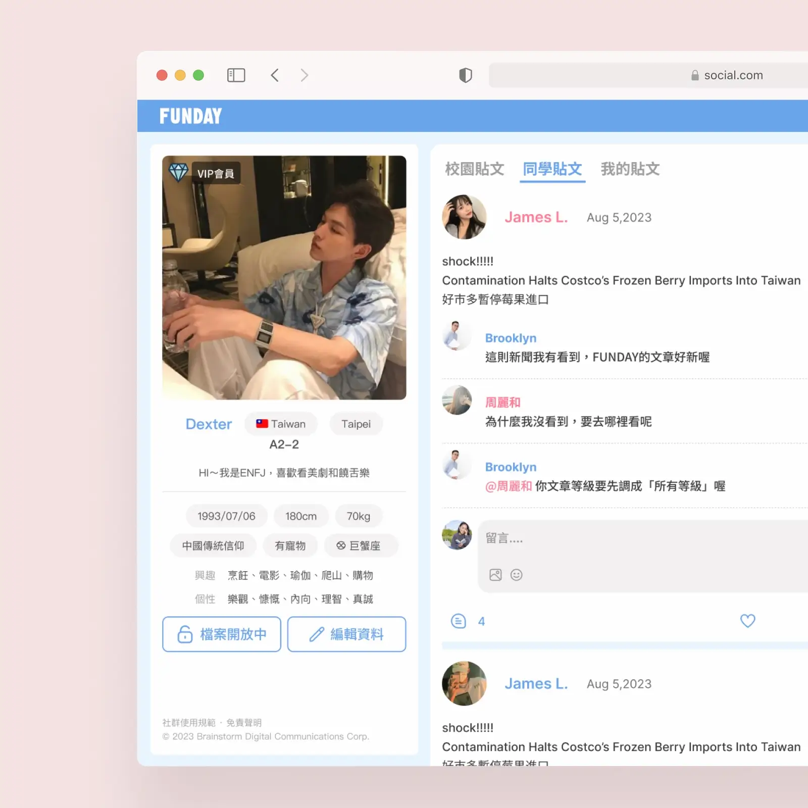
Excessive use of gender-specific colors made the interface visually cluttered
Switching to neutral colors improved visual harmony and shifted focus back to the content
The challenge 2
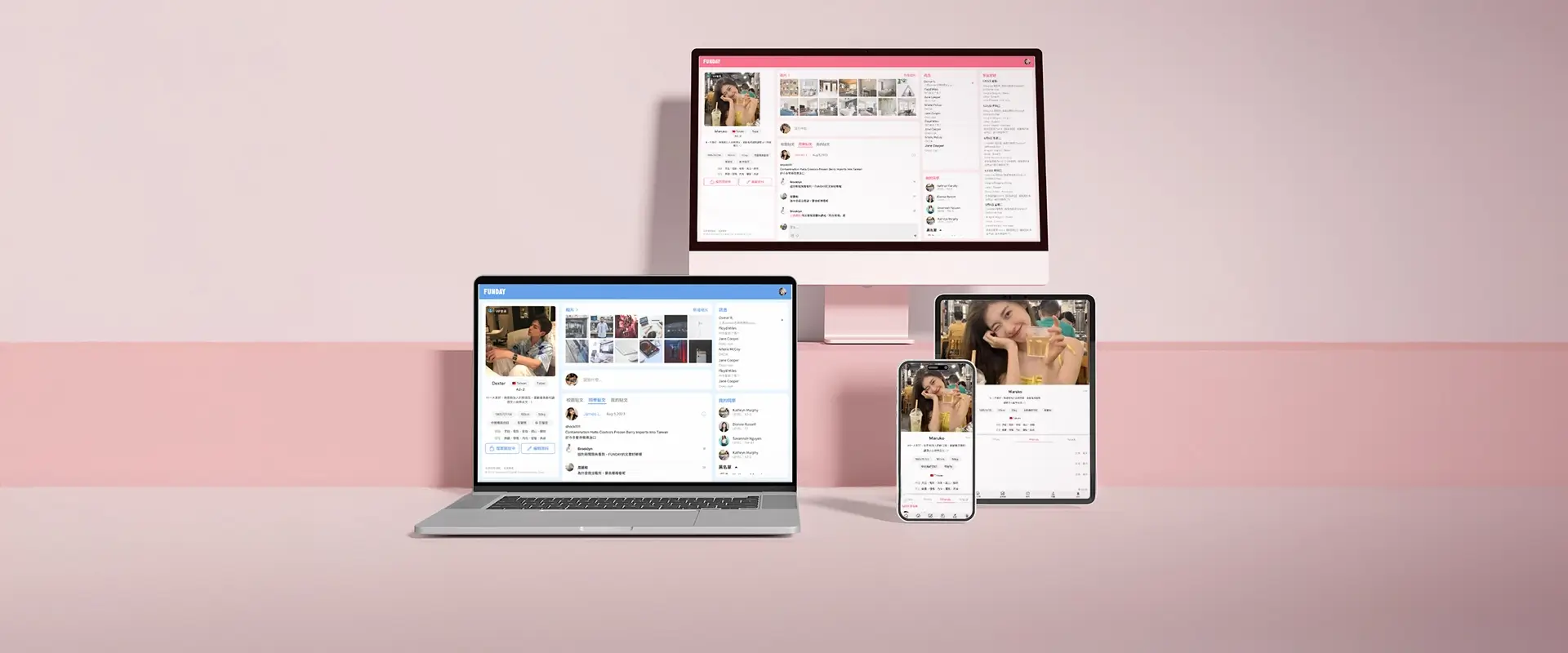
How to ensure a consistent user experience across different devices (desktop, tablet, mobile), making the most of the screen space for each interface. It is crucial to determine which features or information should be prioritized on smaller screens to maintain the usability of core functions, avoid information overload, and still preserve clarity and hierarchy of information.
My solution
On larger screens, information is fully expanded to make the most of the ample screen space. As the screen size decreases, less important content from the right side is removed first and replaced with an icon button next to the profile picture, which opens a floating window when clicked. Once the screen reaches the mobile breakpoint (below 768px), the layout is significantly adjusted, adopting a bottom navigation design to align with common mobile usage habits and enhance the user experience.
As screen sizes decrease, the layout shifts from a fully expanded view to a simplified design with bottom navigation, optimizing usability across devices.
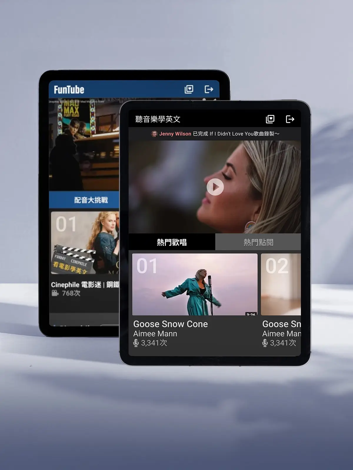
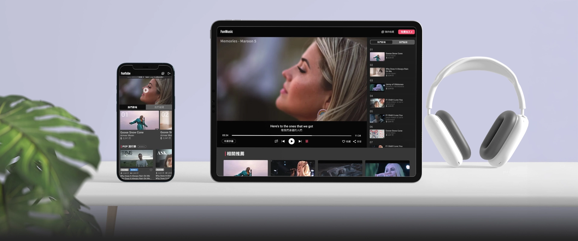
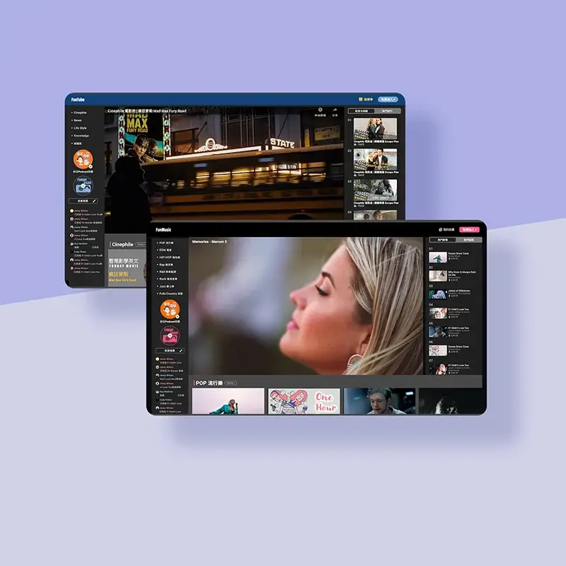
Learn and Enjoy through Music & Movies
DURATION
2021/12 - 2022/2
Role
UI/UX designer & PM
FunMusic and FunTube are innovative platforms that seamlessly integrate music and movies with language learning. By featuring popular songs and classic films, users can enhance their language skills in an enjoyable and engaging environment while immersing themselves in the cultural charm of music and cinema, making every learning experience both fun and meaningful.
The challenge 1
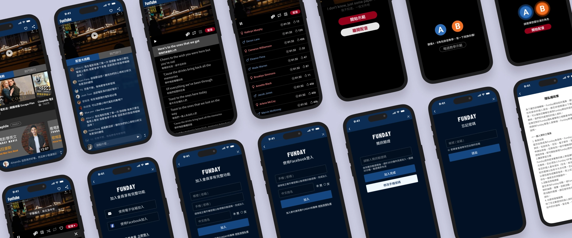
The platform offers users dual functionalities of karaoke and movie dubbing. Designing an intuitive and seamless user guide to help learners get started effortlessly is a key challenge.
My solution
Emphasize the primary action button: Place the "Start Dubbing" button in a prominent position, using large fonts and vibrant colors to ensure it stands out. Incorporate dynamic design elements to clearly guide users through the current step, enhancing intuitiveness and overall user experience.
In the demo video, the dynamic character ripples on the left and the jumping cues on the right clearly indicate the speaking character and their corresponding lines. For experienced users, there is also an option to skip the demo.
The challenge 2
With numerous similar competitors in the market, creating a distinct identity from other video platforms while increasing user retention is a key focus for this product.
My solution
To create differentiation, this product not only provides video playback functionality but also includes unique features such as dubbing and karaoke to stand out in the market. Social interaction features like likes and online chat enhance user engagement and strengthen the overall user experience.
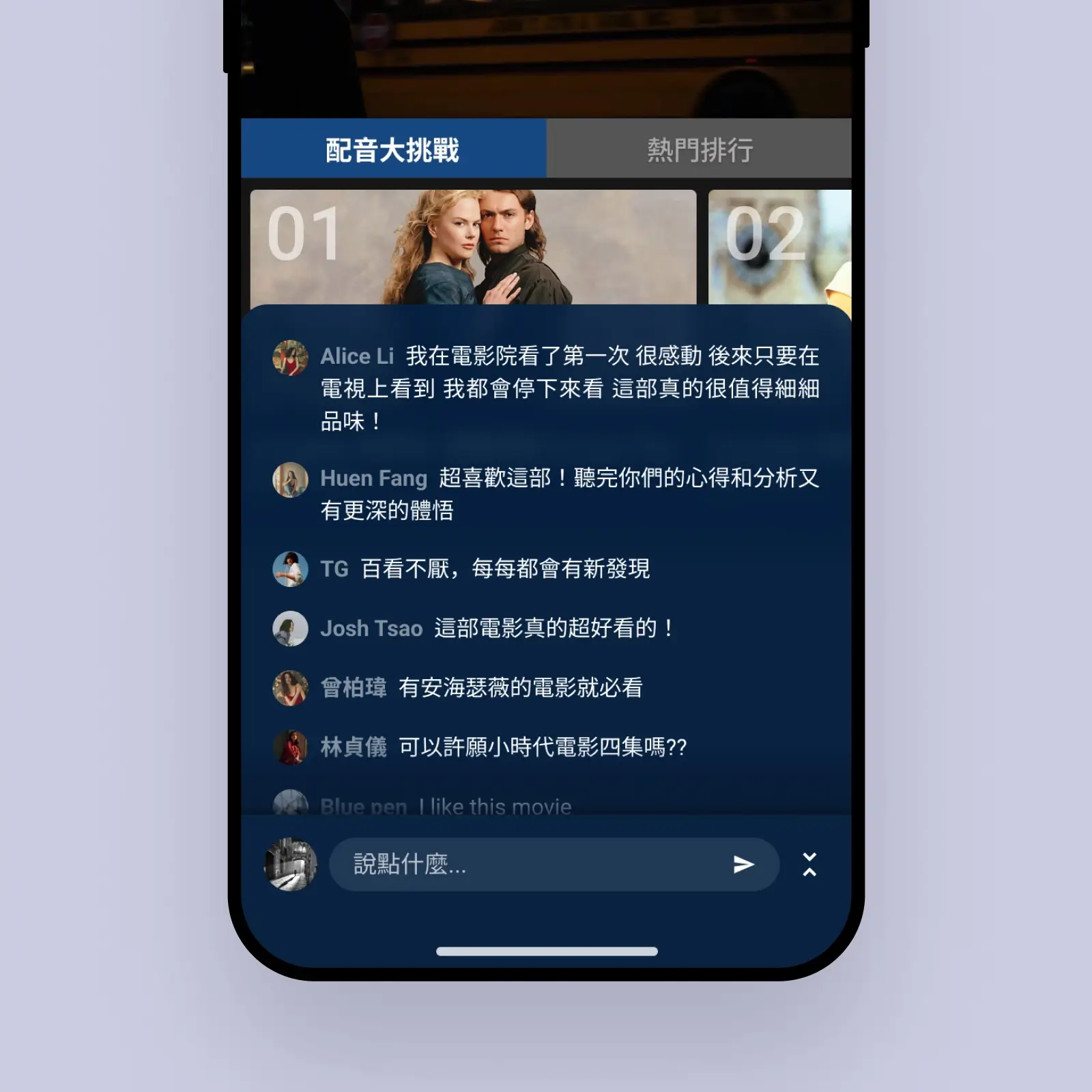
Users can share experiences and join discussions, making learning engaging.
Users can share dubbing results, inviting likes to boost achievement.
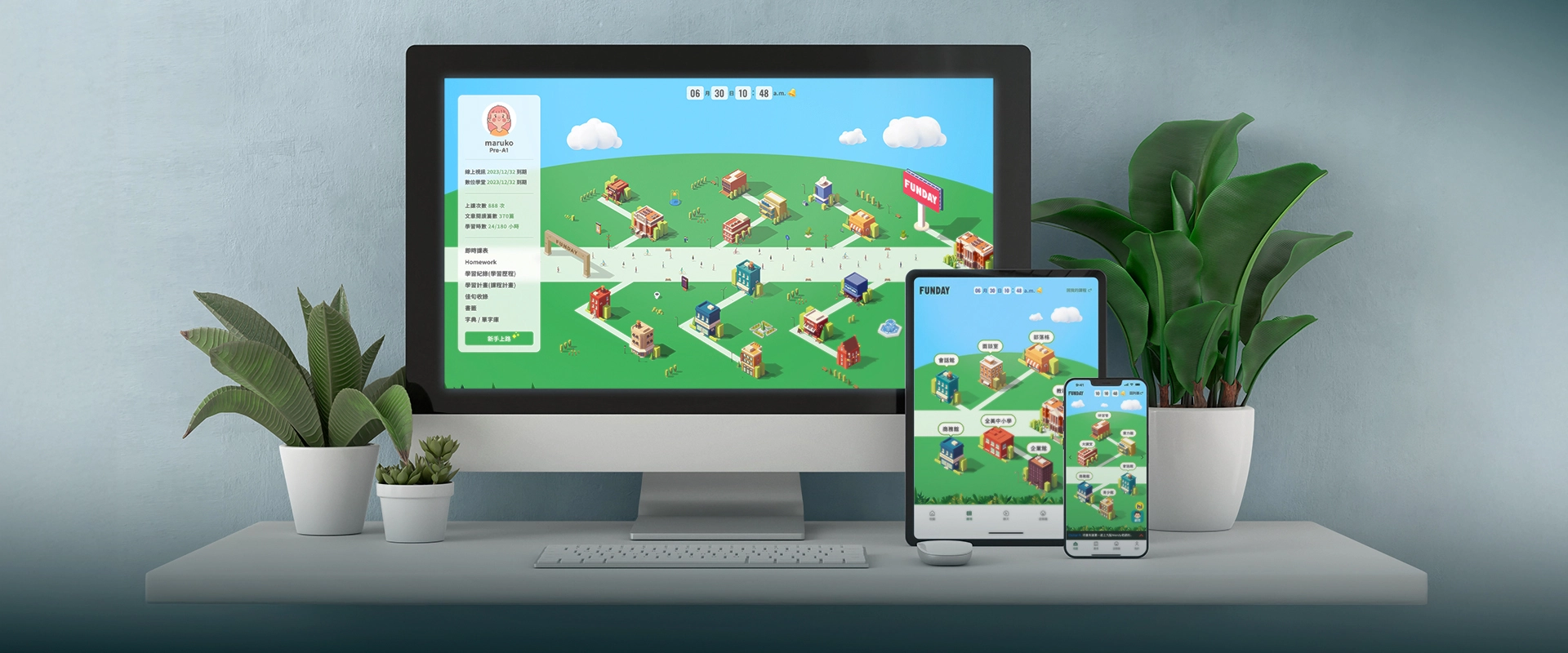
Funday Campus Academy
DURATION
2023/05 - 2023/08
Role
UI/UX designer & Motion Effects
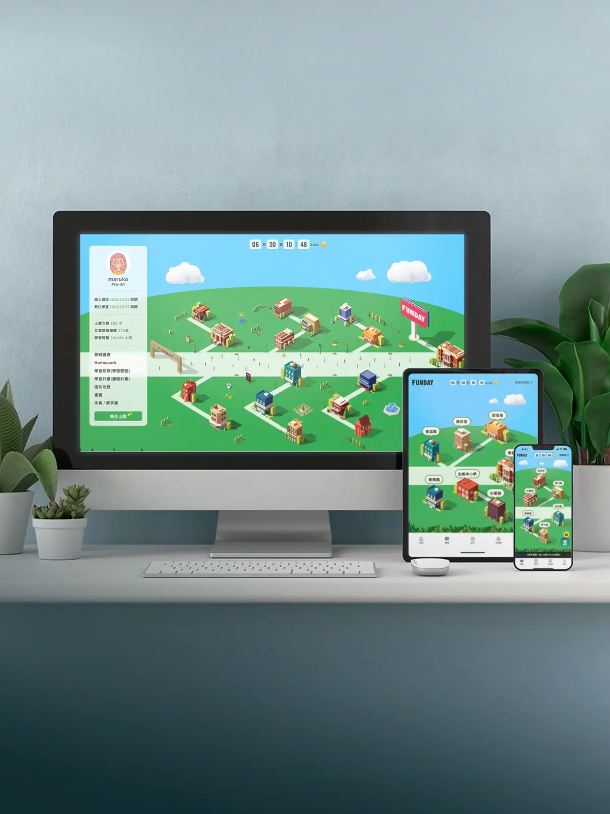
This is an online education platform centered on learning and interaction, offering users an immersive learning experience. The campus simulation on the website includes multiple learning areas, with each building representing different functions and resources, enabling learners to easily find the content they need and learn independently. By gamifying education and integrating social interaction, the platform makes learning more enjoyable and efficient, not only boosting users' motivation but also filling the learning journey with fun and challenges.
The challenge 1
Each building features finely crafted animations. The challenge lies in presenting multiple animated graphics on a single page while maintaining optimal performance, ensuring the images remain distortion-free, and preserving the highest resolution.
My solution
Due to the highly detailed vector files and the large number of layers, I explored various tools for production. Along the way, I encountered multiple challenges, such as slow speeds when importing layers, long waits for dragging nodes, oversized output files, or blurry image quality. Ultimately, I discovered a lightweight tool specifically designed for creating SVG animations, enabling me to successfully complete the animation designs for over 20 buildings in a short amount of time.
Find the right tools to achieve fast production while ensuring high resolution and optimized performance.
The challenge 2
Desktop
Displaying all building names
simultaneously may lead to information overload
and visual clutter. Using hover effects requires
users to explore each building individually,
which can be time-consuming and inefficient.
Mobile
With limited screen
space, ensuring complete and clear presentation
of all building information without compromising
usability or readability is a challenge.
My solution
Desktop
Introduce a toggle switch that
allows users to show or hide building names with
a single click. Utilize directional arrows to
clearly associate names with their corresponding
buildings, reducing label overlap and minimizing
misinterpretation.
Mobile
Divide the map into multiple views,
enabling users to navigate through different
areas via swiping or toggle buttons. Group
buildings by regions, ensuring labels are
clearly aligned and appropriately scaled to fit
smaller screens.
1.Toggle for Seamless Map Navigation
2.Paginated
Design for Enhanced Mobile Experience
66666666
DURATION
2021/12 - 2022/2
Role
UI/UX designer & PM
FunMusic and FunTube are innovative platforms that seamlessly integrate music and movies with language learning. By featuring popular songs and classic films, users can enhance their language skills in an enjoyable and engaging environment while immersing themselves in the cultural charm of music and cinema, making every learning experience both fun and meaningful.
The challenge
Lorem ipsum dolor sit amet consectetur adipisicing elit. Voluptates sequi laudantium quasi beatae, modi, explicabo quo voluptas quae enim culpa ipsum, quas nisi doloribus! Id aliquam error corrupti inventore sapiente.
My solution
Lorem ipsum dolor sit amet consectetur adipisicing elit. Voluptates sequi laudantium quasi beatae, modi, explicabo quo voluptas quae enim culpa ipsum, quas nisi doloribus! Id aliquam error corrupti inventore sapiente. Voluptates sequi laudantium quasi beatae, modi, explicabo quo voluptas quae enim culpa ipsum.
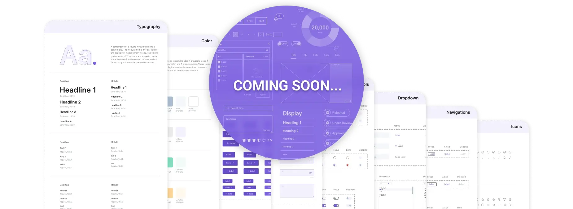
Design System (Coming Soon...)
Design System will include colors, typography, components, and more to streamline your design process!
About Me
Efficiency-driven, always improving.
13+
years in
Graphic Design
5+
years in
eCommerce Design
4+
years in
UI/UX Design & PM
Passionate about researching and optimizing work efficiency. In my work, I always uphold the principle of "making the boss's job easier and the team's efforts more efficient."
I developed a custom reporting module and proactively created various templates and components for team-wide sharing and use.
Resume
Education and practical experience
Driven designer and PM with expertise in graphic design, eCommerce, and UI/UX, dedicated to enhancing efficiency and empowering teams through innovative solutions.
My education
Applied Arts
Course by Fu Jen Catholic University
Specialized in the Computer Animation division, focusing on mastering 3D modeling, animation techniques, visual storytelling, and multimedia production.
Work experience
Graphic Designer
at KUANG HSIN PRINTING CO
My first job after graduation was at a printing company, where I worked for over four years and was promoted from assistant to graphic designer. Later, I gained experience in graphic and advertising design across various industries, including food and beverage, fashion, and parenting.
E-commerce Web Designer
in the Eastern Home Shoppingand Shopee
I entered the e-commerce industry, working as a web designer at Eastern Home Shopping and Shopee for nearly five years. During this time, I adapted to the fast-paced production demands of e-commerce and developed versatile design styles.
Frequently Used Tools
Figma
Photoshop
Illustrator
Midjourney
ChatGPT
HTML5
CSS3